

I designed a responsive e-commerce website for Move, a local sports shop in North London, to help them transition from a physical store to a digital marketplace. The objective was to create a seamless online shopping experience that reflects the brand’s identity while addressing user pain points in navigation, product discovery, and checkout.
To ensure a user-centered design, I followed a structured UX process:
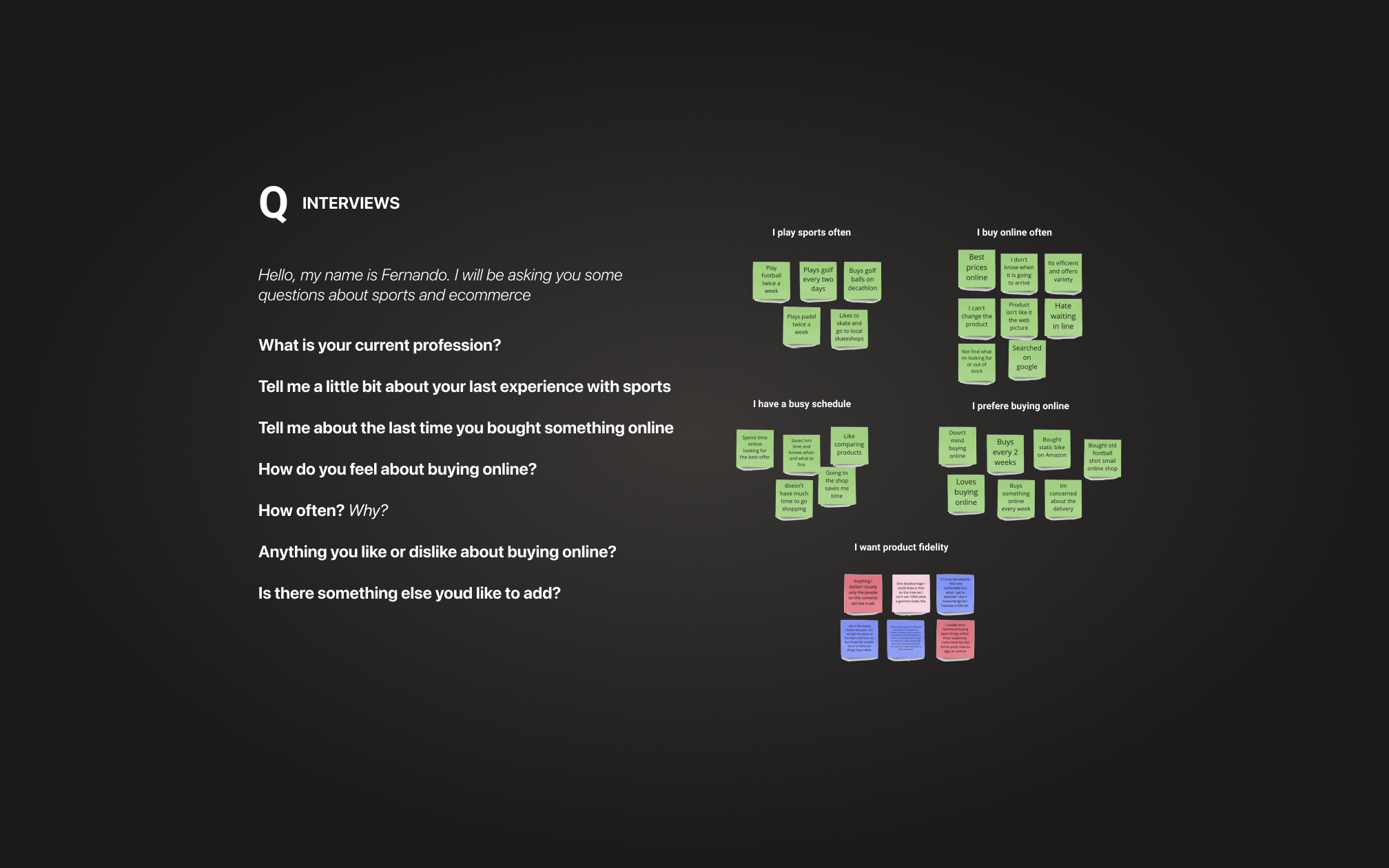
- User Research & Insights: Conducted user interviews to understand pain points, needs, and shopping behaviors. Synthesized findings into affinity maps and personas.
- Competitive & Comparative Analysis: Studied market trends and competitor platforms to identify best practices and differentiation opportunities.
- Problem Definition & User Journey Mapping: Created a problem statement, user scenarios, and journey maps to visualize frustrations and opportunities for improvement.
- Information Architecture & Navigation: Utilized card sorting to optimize site structure and ease of product discovery.
- Wireframing & Prototyping: Designed multiple iterations of wireframes based on user flows, refining them through usability testing to improve the shopping experience.
- UI & Visual Design: Developed a clean, modern interface with an intuitive layout, consistent branding, and a comprehensive UI kit including buttons, icons, and color systems.
- Responsive Design: Ensured a seamless shopping experience across phones, tablets, and desktops, optimizing performance and usability.
The final e-commerce platform provided Move with a strong online presence, enabling them to expand their customer reach and enhance the shopping experience for sports enthusiasts.


I am a Digital Product Designer specialized in User Experience and User Interface design, with a background in digital consultancy and architecture.
"I have wanted to write anything with this title for a long time."
Fernando Álvaro Echevarría Gianello


